In the world of basketball, where adrenaline meets strategy, a team’s logo does more than just decorate jerseys—it tells a story. Today’s fans are not only passionate about the sport; they’re savvy consumers of visual identity. An eye-catching, well-thought-out logo can elevate a basketball team from neighborhood courts to national recognition. Designing a logo that captures the energy, spirit, and personality of a team requires more than graphic skills—it demands creativity and vision.
Whether you’re launching a brand-new squad or rebranding a long-standing team, these five creative concepts will help shape a powerful, memorable logo that your players and fans will wear with pride.
1. Animal Symbolism: Tap into Power and Ferocity
Animal-inspired logos remain a dominant trend in basketball because they so effectively embody qualities like strength, speed, and aggression. Think of the Chicago Bulls or the Minnesota Timberwolves—these logos instantly evoke emotion and character. Selecting an animal that aligns with your team’s playing style or ethos can create a visual shorthand for your brand identity.
For example, a team that prides itself on relentless defense may choose a panther or a hawk as its mascot. The design can be stylized to appear modern or aggressive, with bold lines and fierce expressions. Adding motion blur, claw marks, or flared wings can enhance the intensity designed into the symbol.
Design Tip: Combine claws, fangs, or wings with stylized typography to enhance brand cohesiveness. Use color schemes like black and red or dark blue and silver to convey dominance.
2. Urban and Street Art Style: Connect with Culture
Many basketball teams hail from urban centers, and their identity is deeply entwined with the culture of their city. Graffiti-inspired logos, stencil fonts, spray-paint textures, and even skyline silhouettes can form the backbone of a design that pays homage to the team’s urban roots. Brands like the Brooklyn Nets embrace their city in a stylish, contemporary way that resonates with a younger audience.
Incorporating gritty, textured elements in your logo lends a raw authenticity that appeals to fans of all ages. Using elements like brick walls, chain-link fences, or subway symbols can further contextualize the visual identity.
Design Tip: Opt for hand-drawn or distressed typefaces, and apply limited color palettes with bold contrast—like black on neon graffiti green—to create a rebellious yet rooted visual impact.
3. Retro Revival: Blend Nostalgia with Personality
Throwback logos that echo the design styles of the 70s, 80s, or 90s carry strong nostalgic appeal. This creative direction is perfect for teams wanting to evoke a legacy, even if they’re relatively new. Retro designs often feature script fonts, geometric balls, and retro color palettes like burnt orange, mustard yellow, and royal blue.
A retro logo can differentiate your team from a sea of futuristic logos. Instead of sharp and aggressive, it leans into familiarity and fun—an angle that can attract fans who appreciate vintage vibes and old-school sport culture.
Design Tip: Maintain readability even when using cursive or old-style fonts, and consider adding secondary logo elements like badges or team hits that echo historical emblems.
4. Minimalist Geometry: Keep It Sleek and Modern
Clean lines and simple shapes can be surprisingly powerful. A minimalist geometric logo cuts through visual noise and lends an air of sophistication rarely found in overly complex designs. Unlike mascots or graffiti styles, these logos are often built around angular shapes, repetition, and symmetry.
For example, a circular design containing the initials of the team surrounded by a simplified basketball silhouette can be distinct, easily recognizable, and highly versatile. These logos reproduce well on everything from jerseys to merchandise, which makes them a smart choice for branding longevity.
Design Tip: Choose two to three colors max, and use negative space expertly to reveal hidden shapes or letters. This approach keeps the logo clean and meaningful.
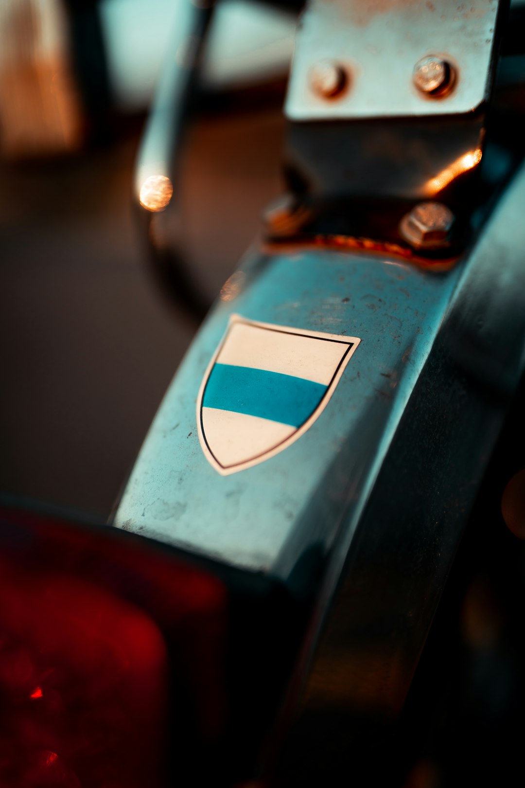
5. Heraldic and Emblem Style: Showcase Prestige and Territory
If you want your team to convey tradition, honor, and territory, consider a heraldic emblem. These shield-like logos—including banners, crests, or coats of arms—are perfect for schools, tournaments, or city-sponsored teams that aim to emphasize history and prestige over personality.
These logos often incorporate a mix of icons: a basketball, a symbolic object like a flame or sword, or initials placed within a formal shield. There’s also flexibility to work in local flag colors or city emblems to anchor the team’s sense of place.

Design Tip: Use symmetry to create balance, integrate detailed line work, and make sure the emblems scale well even when used as small secondary graphics.
Final Thoughts
Basketball team logos are more than just emblems; they are visual cornerstones of a squad’s identity. When designed thoughtfully, they set the tone for how fans, competitors, and communities perceive and connect with your brand. Whether you’re inspired by animal ferocity or geometric simplicity, choosing a direction that fits your team’s soul will echo across jerseys, billboards, and social media for years to come.
FAQs
-
Q: How important is color choice in a basketball logo?
A: Extremely important. Color conveys emotion, sets the tone, and helps differentiate your team visually. Consistent, striking palettes can enhance recognition and fan loyalty. -
Q: Should a logo include a basketball image?
A: Not necessarily. While many do include a ball, others focus on mascots, initials, or unique symbols. The decision should reflect your brand’s direction and uniqueness. -
Q: How can a small team create a professional-looking logo?
A: There are many affordable design tools and freelance designers available. Begin with a concept, message, and audience in mind. Use design templates as a starting point if budget is limited. -
Q: Is it better to redesign or evolve an existing logo?
A: Evolving an existing logo works well if the brand has equity. Redesigning is better when the current logo doesn’t resonate with the team’s current values or fanbase. -
Q: Can a team trademark its logo?
A: Yes, and it’s highly recommended. Trademarking protects your identity from unauthorized use and ensures legal rights to your branding materials.
I’m Sophia, a front-end developer with a passion for JavaScript frameworks. I enjoy sharing tips and tricks for modern web development.
