The real challenge isn’t just growing your email list, but making every signup feel like the start of a meaningful connection. An email signup form is your first impression, your handshake, your opening line in a conversation. Done right, it sets the stage for trust, engagement, and long-term loyalty.
In this article, we’ll explore how to turn your signup forms into relationship-builders. From strategic placement and compelling incentives, you’ll learn how to create forms that don’t just capture emails—but open doors to real connections.
The Role of Personalization in Email Marketing
Email marketing without personalization is like shouting into a crowd—some might hear you, but most will tune out. Today’s audience expects more than just another generic newsletter. They want emails that feel like they were written just for them.
And it all starts with the signup form. A strong form doesn’t just collect email addresses; it gathers insights. Whether it’s a simple preference checkbox or a dynamic lead magnet, every detail helps craft a more personalized experience from the first interaction. The better your signup process, the stronger your foundation for real, meaningful engagement.
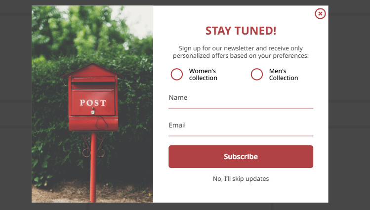
The good news is that there are platforms that make it easy to create signup forms with various designs and levels of personalization. No coding skills or developers are required.
For example, the Claspo popup builder offers a drag-and-drop editor where you can create different forms by simply dragging and connecting ready-made blocks and elements.
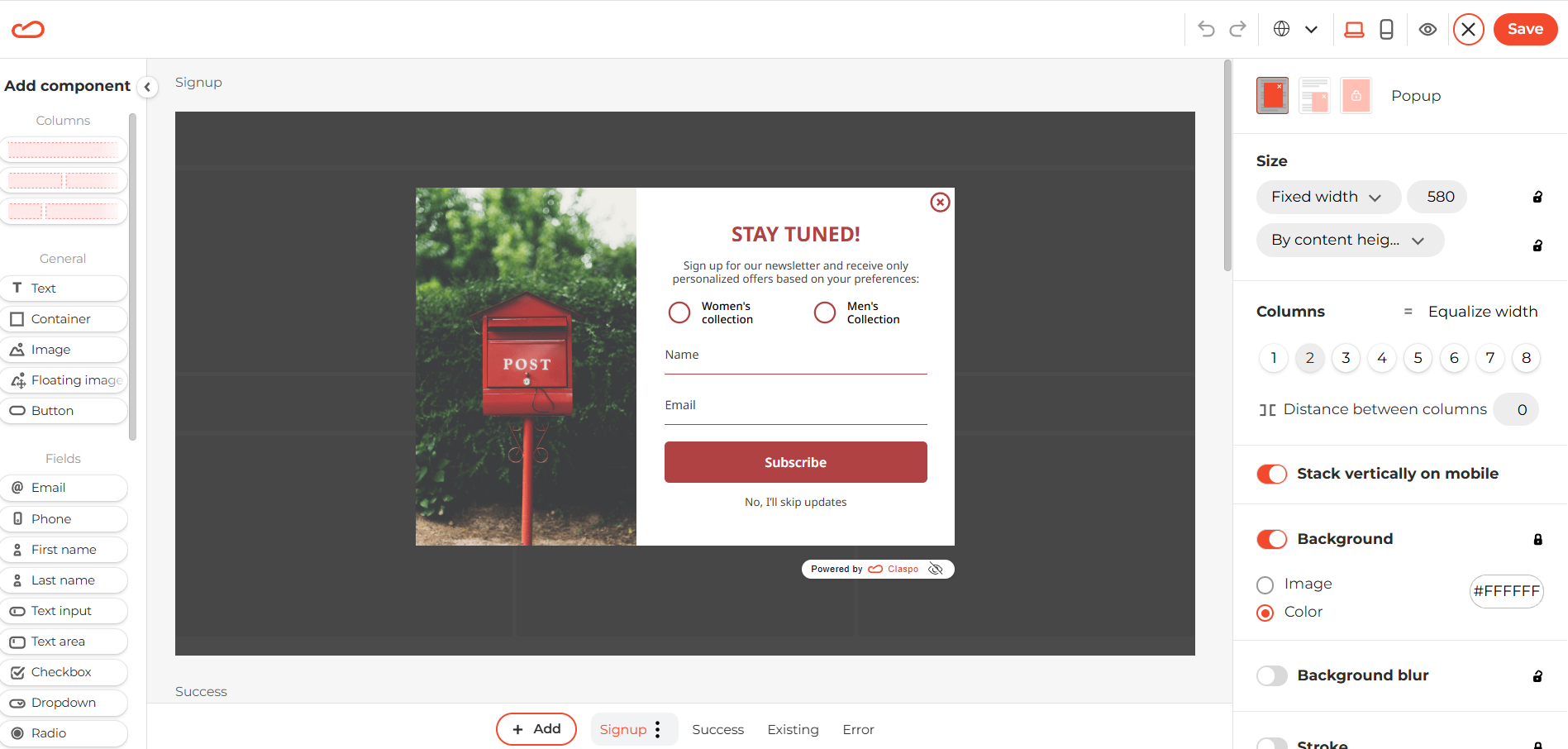
Claspo’s drag-and-drop editor
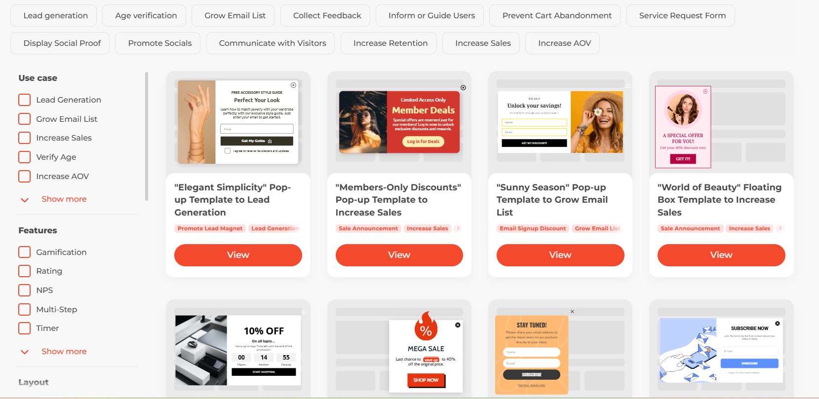
Plus, there’s a large library of pre-designed popups. You can either use a Claspo template right away or customize it in the editor to fit your needs.
What Makes an Email Signup Form More Than Just a Form
An email signup form isn’t just a box for collecting addresses—it’s a moment of decision. Why is someone subscribing? What are they hoping to get? Understanding intent helps you craft a form that feels less like a transaction and more like the start of a conversation.
Transparency is key. Visitors need to know what they’re signing up for—how often they’ll hear from you and what kind of value they’ll receive. Hidden agendas lead to unsubscribes. Clear expectations build trust.
And then there’s engagement. A well-designed form nudges users toward deeper interaction. Whether through a compelling incentive, a smartly placed preference field, or a seamless user experience, micro-conversions (like selecting an interest or clicking a confirmation email) lay the groundwork for stronger relationships.
A great signup form is the first step in turning a visitor into an engaged subscriber.
Strategies for Creating Email Signup Forms That Connect
A signup form is only effective if people see it at the right moment. Strategic placement matters. A well-timed popup, an embedded form after a compelling blog post, or a sticky header on high-intent pages can make the difference between a casual visitor and a new subscriber. Test different placements to find what works best for your audience.
But visibility isn’t enough—subscribers need a reason to opt in. Incentives that resonate go beyond generic discounts. Think of exclusive content, industry insights, or interactive tools that align with what your audience values. The more relevant the offer, the more meaningful the signup.
Finally, copy and design elements play a huge role. A dull “Subscribe Now” button won’t inspire action. Instead, use conversational, benefit-driven language like “Get Weekly Growth Hacks.” Design matters, too—clean layouts, contrasting CTA buttons, and minimal form fields make signing up effortless.
A great email signup form isn’t just about gathering contacts. It’s about meeting users where they are, offering value they can’t resist, and making the signup process feel like the first step in a relationship—not just another transaction.
Measuring Success: Engagement Beyond the Form
A signup form’s success isn’t just about how many people fill it out—it’s about how well it engages the right audience. Metrics that matter include conversion rates, time spent on the form, and abandonment rates. Are visitors hesitating? Dropping off at a certain field? These insights reveal whether your form is inviting or driving people away.
To improve performance, run A/B tests on key elements. Test different headlines, CTA buttons, field lengths, or even form placement. A small tweak—like changing “Subscribe” to “Get Exclusive Tips”—can significantly impact conversion rates.
Beyond numbers, user feedback is invaluable. Heatmaps, exit surveys, and direct responses can show why people hesitate to sign up. Maybe the form asks for too much information upfront, or the incentive isn’t compelling enough. Adjust based on real user behavior, because the best forms don’t just capture emails—they create a frictionless, trust-building experience.
