Writing a website copy is a task that should definitely not be taken lightly. The copy is what contacts the visitor directly, so it needs to be written in such a way that it captures visitors’ attention and makes them engage with the website immediately.
Because of that, you can’t just slap any kind of text onto your website and call it a day. Well, you can, but the results won’t be very good. Instead, it pays to think about the kind of people who are your target audience. What do they like? What do they expect? What do you want from them?
To help you come up with the best possible text, here’s a short and quick guide for writing a copy for your site.
Tone
Striking the right tone is extremely important. To do that, you have to know what your readers/visitors expect from you. For example, if you’re a serious website dealing with a serious topic (politics, finance, that sort of thing), the tone you set should respect that.
Likewise, if your website is all about a fun and entertaining approach to a subject, that’s how you should write your copy, too. Feel free to crack a mild joke as well (just make sure it’s a fairly good one) to communicate to your readers that they can relax here.

A very efficient technique that can help you achieve that goal is called “Voice of the Customer”. The main premise of it is quite simple – you write your copy in a language that closely resembles the language your potential customer might use. In other words, you try to deploy simple expressions that are fairly simple for everyone to understand but which describe a common problem in your field of expertise.
A good way to choose the best vocabulary is to go through user reviews a bit, maybe even dedicated forums and places like that, just to see how your potential clients communicate and what’s on their minds the most.
Style
Now that you’ve defined the tone, you can expand on those principles to create your own style. This is actually nothing more than coming up with a set of rules content creators and writers should follow.
Naturally, these rules should also follow your main ideas and work towards establishing your brand the way you want it to be established. This is especially useful if you’re planning on featuring more than one type of content on your website.

By establishing the main principles of your style, you will be able to convey exactly how a piece of content should be written. Therefore, both you and your readers will know what to expect, which is very important: your site will be consistent and will, therefore, be more recognizable by the readers.
It will be perceived in a certain way and this will thus help with developing brand awareness. But be careful, because you don’t want anything to stick out like a sore thumb on your site because this usually doesn’t do you much good.
Say how you can help
One thing that’s exceptionally important to emphasize is that you have to put your visitors/potential clients first when it comes to creating the right website copy.
People who are visiting you, especially if you’re offering a service or a product, probably have a problem that needs solving or a need that needs to be addressed. So, you need to be very clear when stating why your website is the right place for them and how you can help.
Do not spend too much time enumerating the qualities and features of your product, that can turn a fair number of people away. Sure, there may be some fans of your brand who are absolutely ecstatic about what you have to offer, but most people will come to you searching for answers and it’s up to you to provide them.

In a sense, the website you create should not be about you but about the way you can help other people. Be direct and simple when it comes to this and state the benefits people will feel when using your product as clearly as possible.
This is not to say that you shouldn’t highlight the features of your product – it’s always good to do that in order to show your potential clients what they will be dealing with, but always connect that to the way it makes people’s lives easier.
Essentially, it’s all about making the right first impression, because if you can grab their attention immediately by stating how their problems will be solved, you’re already halfway towards making a sale.
Keep visitors’ attention span in mind
We’ve all been there: you come to a website you like or you’re interested in and only glance over the titles/headlines to see if there’s something that would make you stay. Most people do that, so if you’re setting up a website, you have to keep that in mind.
Don’t expect people to read every single sentence you’ve written because your website is not a tense love novel that will grip the reader for hours. And it’s not supposed to be.

Because of this, you need to bring out the big guns right away. The most important information you have to offer to your visitor should be the first thing they see when they come to your website. You need to spark their interest immediately, so there’s no time to waste.
Psychologists suggest that we form the opinion of another person in a matter of moments when we meet them for the first time, and the same can be said of websites. So do not waste your chance to leave a good first impression.
Write a copy that complements your design
A copy is something people will hopefully clearly see when they come to your website. However, it is (again, hopefully) not the only visual element of your website.
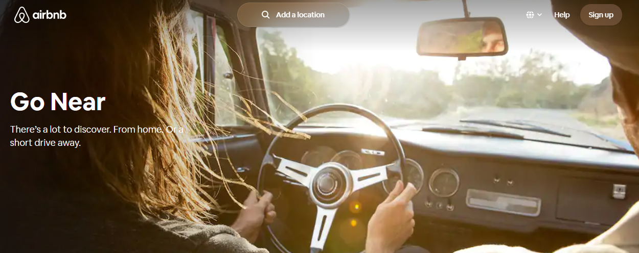
Combine inspiring and wonderful images and then integrate copy elements into them the right way and you will have a combination that is visually very appealing but at the same time relays information about your website to the reader.
Surely, an average internet user will spend a lot more time on such a website, which is one of the most important metrics Google considers, and will thus probably read your copy more thoroughly. Humans are visual beings and if you want to lure visitors and keep them coming back, you might want to consider hiring an international web design agency.

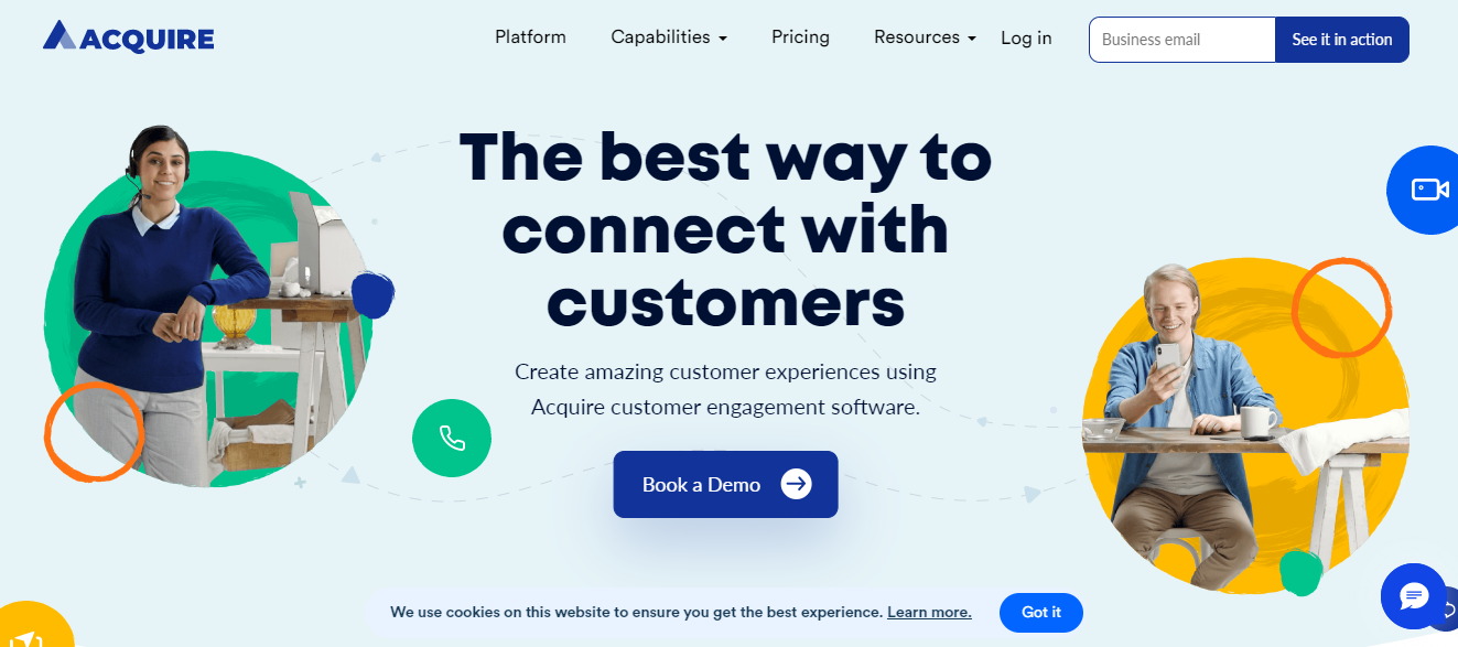
And since you will grab people’s attention with wonderful images, it’s a good idea to insert some sort of call to action into the copy and maybe even put a button there. That way the visitor will surely know where they need to click to get the product or service you’re offering.
Again, be concise and get straight to the point with CTAs – you have to clearly express what is expected from a prospective customer: “Book a tour now!”, “Order your copy here!” and “Sign up for a free trial!” are some pretty good examples.
Other worthwhile tips
Having covered the most important things in the paragraphs above, now it’s time to go through a few more tips that could help you create a good website copy.
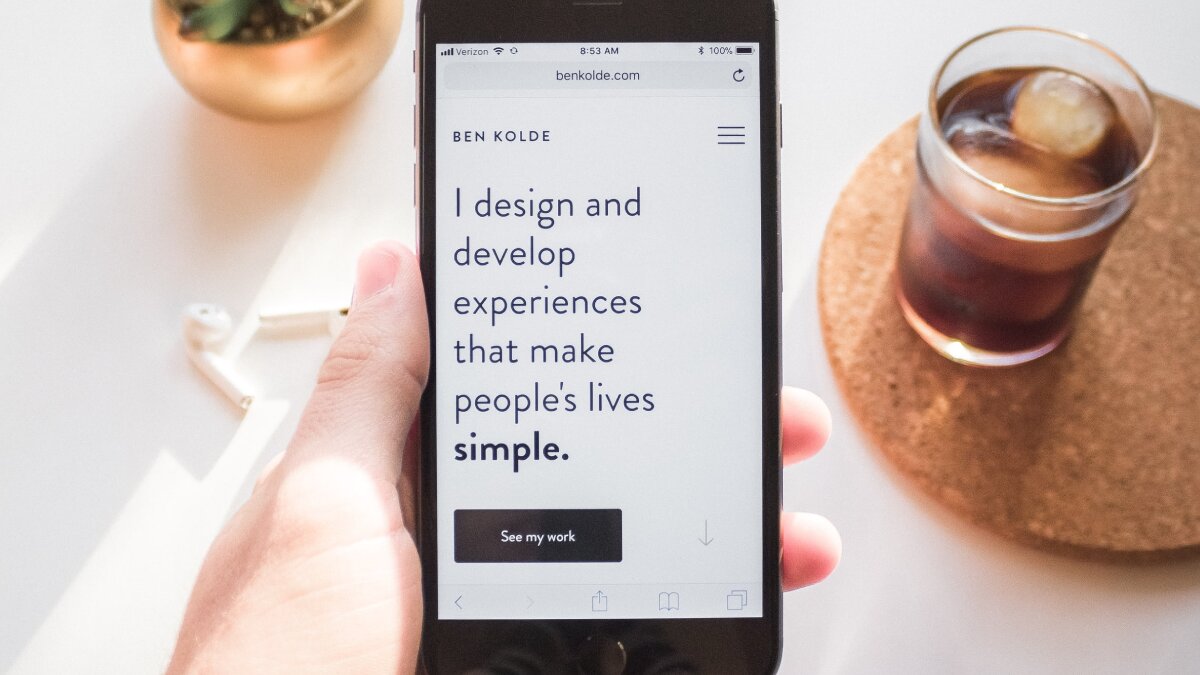
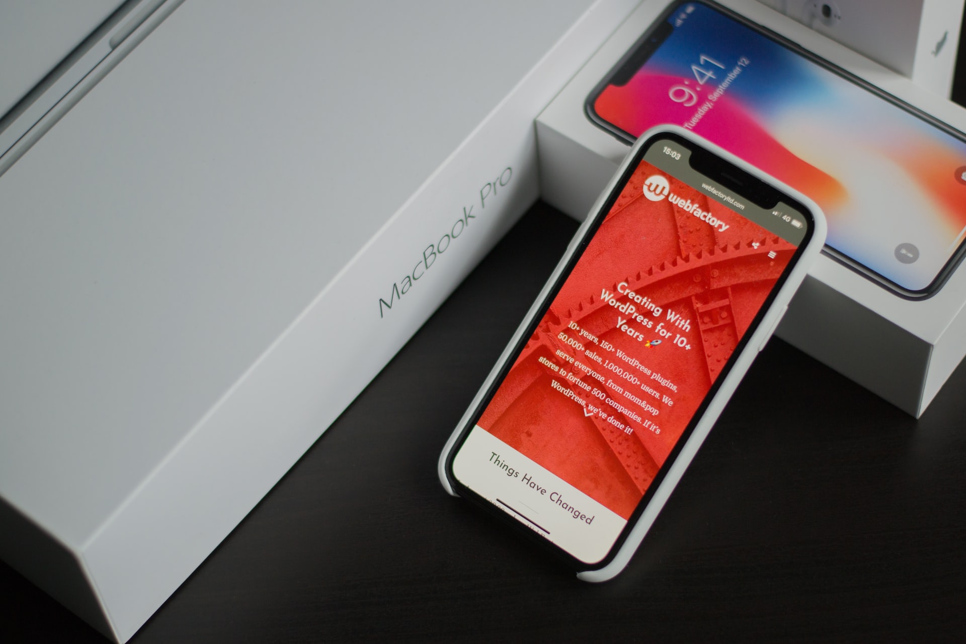
First, remember to make sure everything works as intended on mobile devices too. Or in other words, that your site is mobile-friendly. With every passing day, mobile devices become increasingly more important, so if there are any malfunctions there, you risk alienating a large chunk of your potential audience.
Smaller paragraphs are recommended exactly for this purpose, plus you can do a whole lot of other tweaks on your website’s mobile version, such as adding “read more” buttons, editing the font size, and so on.

Next, keywords. They are essential if you want to position your website well on Google, but using them in your website’s copy can also help you increase conversions.
Basically, keywords are how users think when they’re searching for something, so if they can spot what they were looking for on your website right away, chances are that they will stick around.
Also, check your texts thoroughly! Eliminate any and all typos, spelling errors, and grammar mistakes. These can have a very negative impact on the way people perceive your website.
If people see that there are mistakes on multiple pages, their opinion of you will drop and they will think that you didn’t care enough about your website to proofread it. And if you don’t care about it, why should your visitors? So don’t let yourself slip on something like this.
The bottom line
Keep the copy as simple as possible, both in terms of its length and its vocabulary. Also, make the effort to explain to your visitors in short sentences how you can help them and why you are the best person/company for the job.
People have to see from the beginning that, with your website, they have found what they’ve been looking for. And if they immediately see that they are in the right place, they will most likely stay with you much longer.